Table of Contents
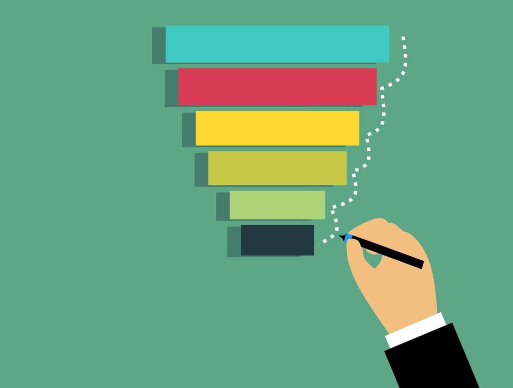
Photo by Mohamed_hassan on Pixabay
I regularly come into contact with people who’ve created fantastic online courses. They’ve taken the time to set up a sales funnel landing page that draws in loads of interest from potential customers.
But sometimes, I get clients coming to me who are frustrated. Even though they’re getting lots of people coming to their site, those people don’t convert to paying customers. If that’s the case, the problem may be your landing page funnel.
In this blog, we’re going to look at:
- What landing page means
- How to get your landing page to operate at a really high level
- Examples of sales funnel landing pages
To have a successful online business, you need sales landing pages designed to engage potential customers and motivate them to take action – purchase a course, book a sales call, or sign up for a webinar.
While you might already have a well-designed sales landing page, understanding its performance can be tricky.
Let’s take a look at how it’s done.
What is a landing page?
A landing page is a web page designed to convince your audience to take some action – buy your product or service, book a call, sign up for a webinar or lead magnet, or do anything you want them to do.
It’s the first page your potential leads land on after clicking on the link from your emails, Google ads, Facebook, or any other place you promote your site. The landing page is the first step to your sales funnel pages.
Landing page vs. sales funnel: What’s the difference?
Your landing page is the page people enter your website on. It’s where they “land” and the first stage of your sales funnel.
Depending on the complexity of your business, you may have different pages you want to guide potential customers to. Customers may need to go through various stages of the sales funnel before they make a purchase.
Get Your FREE Personalized Report
Why do you need a great sales funnel landing page?
A well-designed landing page will make sure that people who come to your website take the action you want and move into your sales funnels.
Every single detail on this page matters because it can influence the conversion rate.
The key is to understand your audience and find a way to catch their attention so that they stop, read your offer, think about it, understand it clearly, and decide to buy the product or take the next step.
Want to know how much more revenue you could make with an optimized funnel? Use our calculator to find out.
How to build a perfect landing page
Whatever your goal, your landing page is the first of your funnel pages. It needs to impress potential clients. A successful landing page should have:
- a catchy headline and subheading that talks to your target group
- information about the product/service/lead magnet/webinar
- a list of benefits: why they should do what you ask them to do
- product/service features: how you are going to give them those benefits
- information about your irresistible offer
- testimonials from clients who have already bought the product
- answers to Frequently Asked Questions
- information about the course creator or, company or team so that you can build trust and authority
Sales funnel landing page examples (good and bad)
Although the landing page might look like any other web page, its purpose is different: to get you conversions. And that’s why it has to be designed in a different way. There are a few key points you or your designer should follow to make the landing page as effective as possible so it converts best.
Keep it simple
The landing page has to be easy to navigate and cannot be overwhelming when people first look at it. Having a minimalistic design will improve the focus of your audience and make it easier to find the information they need.
The layout should guide the eye of the customer to high-priority sections, and it shouldn’t be distracting in any way.
The call to action should be impossible to miss. It’s also a good idea to place the CTA button on your landing page at least two times. First, above the fold so that people can see it immediately after opening the page, and the second time at the bottom after the offer.
Here is an example of a badly designed landing page:
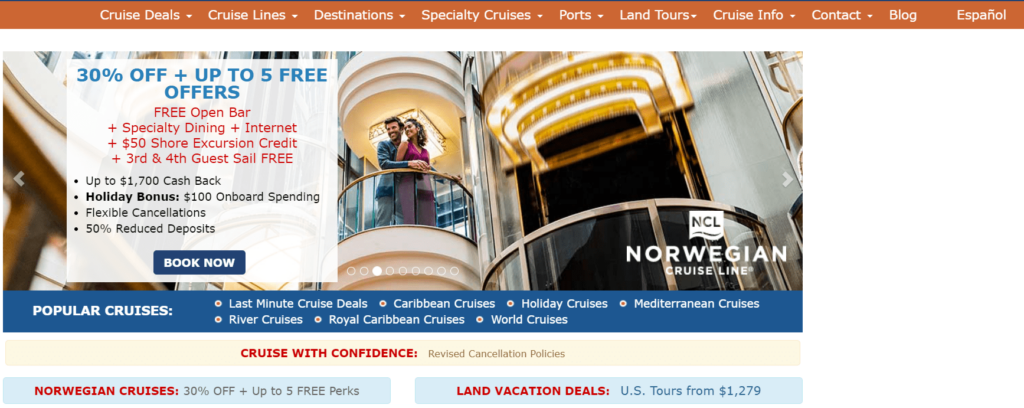
There is a lot of information everywhere on the page, which confuses the audience. The landing page is not clear, and the audience might not know where to look to find what they’re looking for.
Choose appropriate colors
It’s well known that colors are a big part of how we perceive websites. They influence our feelings and actions. You can find out more in this article.
Depending on your business, adjust the colors on the landing page builder to your audience so that it converts better.
It’s important to remember that CTA buttons need to stand out. Make them in a color that is easily visible and eye-catching.
When designing the funnel landing page, think about what your target audience needs. Keep the colors on your landing page in line with your brand colors.
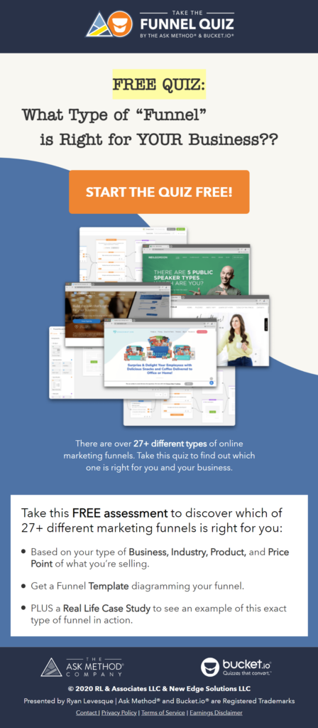
Here is an example of a well-designed funnel page with colors and fonts matching the brand:
Make it responsive
Nowadays, we work on many different devices: laptops, tablets, and even mobile phones. If you want to target more people, your sales funnel landing page needs to be responsive.
Make sure that your page works on all the devices. Check the layout, forms that have to be filled in, and all the buttons. Whatever device people use to reach your website, they have to be able to see it clearly without having any errors.
Choose a catchy header
The first thing visitors see when they come to your website is the header. It should be written in a way that convinces people to read more. For example, if you have a blog about bringing up children, your header could be “Everything Mums Need To Sleep At Night.” If your goal is to help real estate agents, you could go with “For Real Estate Agents Who Want it All.”
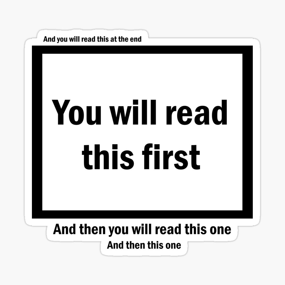
Choose a headline
Out of ten potential customers, at least seven are likely to leave the page without clicking through to anything.
To minimize that number, the headline needs to be clear, understandable, and catchy. After reading it, they should be able to figure out what your offer is about, what it is for them, and how valuable it is. The goal of the headline is to make people read whatever is written underneath it.
Be intentional with your copy
You need to write the copy on your website in a neat, clear, and concise way. Speak directly to your audience. Using words like “you” and “your” will make them feel more engaged, and they will be more willing to stay on the website.
The purpose of the copy is to draw attention, make your potential customers stop for a minute, read what you have to tell them, and decide, “Yes, this is what I need.”
Copywriter and marketing expert Perry Belcher has an easy-to-follow 21-point sales letter formula. Here are some of the steps included in his guide:
Identify the problem
Start with identifying the problem of your audience. Show them that you know what it is they’re struggling with and that you can relate to their situation. Once they see you are aware of their problems, they will be more willing to listen to what you have to say.
Show them the solution
Provide the solution for the problems. Explain how you overcame the obstacles in your life and how it impacted your business. The solution should be explained in an understandable way.
Mention how long it took you or your clients to see the first results after implementing the solution in your business. People want to see results. For some of them, it will take longer than others, but it is important to let them know what to expect.
Show them how their life can change
Finally, show your potential customers how their life can change. Explain that the solution you’re providing them can improve their future and make their business better and easier in the long run.
Add credentials and testimonials
Make your offer and results more trustworthy, and add some credentials. Show your audience that you have experience in what you’re doing. Add some of the certificates or badges you have. You can also add logos of businesses you supported successfully.
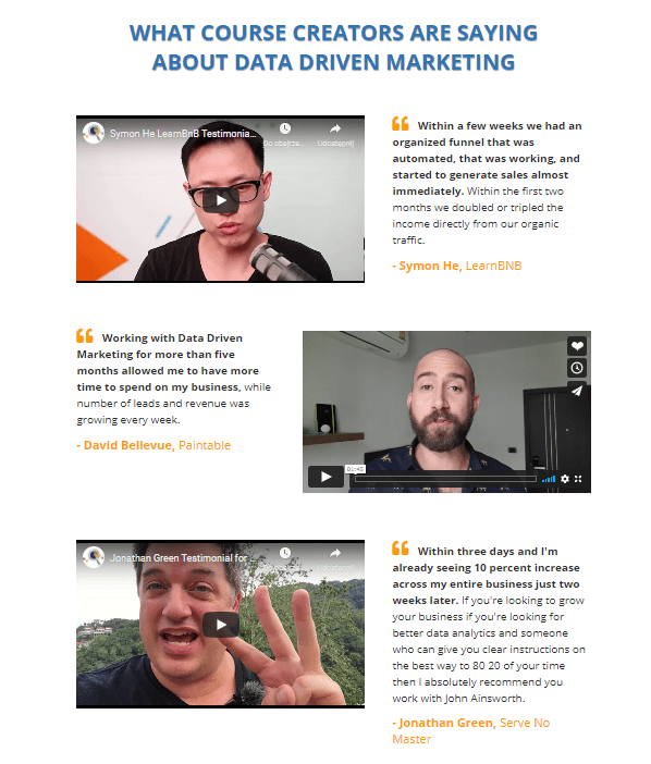
Testimonials are another great way to establish credibility. Having social proof that what you do is working will help you get more clients. Testimonials build trust and are a perfect way to back up your experience.
Top tip: Make sure to add the name, company, and potential function of the person giving the testimonial; otherwise, it may appear fake.
You can also add trust icons to make your page more credible. A trust badge is an icon handed out by a company like McAfee or PayPal to say your website is safe to do business with.
Present your irresistible offer
Explain your offer. By now, your audience should feel that you understand them. You showed them you know what their pain points are, and they are interested in the solution, so now you can show them the whole offer.
Your product or service is not your offer. This means that your offer is not simply a recap of what your product or service will do. You also need to explain how and why the customer’s life will be better if they make a purchase. In order to make the offer irresistible, there are many things you should add to it.
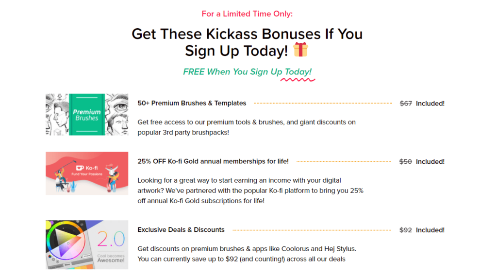
If you have bonuses or some free trials that go with the main product, add them in this section. You might want to offer a free resource that your audience will be able to download once they buy your product or an additional product at a better price.
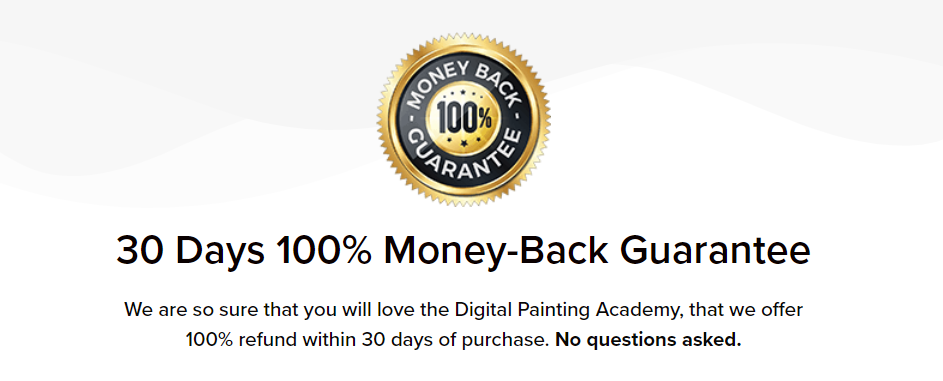
To make it even more convincing, add a money-back guarantee. People are more willing to buy a product if they know they are secured by a money-back guarantee in case something doesn’t work.
I wrote about how to create an irresistible offer for your webinar in this blog post. The same concepts that work for a webinar will work on your landing page sales funnel as well.
Here is another example of a well-designed sales landing page.
Tactics to get more sales funnel page conversions
When it comes to writing copy on a landing page, there are a few strategies you can follow. Remember that the content needs to be informative and clear. It has to give people insight into what they will get once they buy your product. It should convince them to go ahead with the purchase and make them feel good about it.
We usually use two strategies we’ve found to work really well:
1. Urgency
The idea behind this tactic is to push your audience to act fast. When people are facing a limited-time offer, they start to think if they feel comfortable letting the offer go. FOMO, or Fear Of Missing Out.
Copy that tells people they only have a limited time to decide if they want to purchase your product can make it appear much more valuable to them.
2. Scarcity
Tell people that there’s only a limited amount of whatever they’re buying. This also triggers FOMO. People want to buy something quickly before it’s unavailable.
Using urgency and scarcity can push people to take action. But be careful not to fake it. The trouble is that if you say there are only a few of something and they’ll soon be gone, you can’t email them the same offer with the same stuff that’s supposed to be scarce at the same price a month later.
Have a clear call-to-action
The goal of the CTA on your landing page is to convince the audience to take action. It needs to be clearly defined and a visible button in a stand-out color. Whether it is encouraging people to download a free resource or to register for a webinar, the idea should be clear so people know what they are signing up for.
The CTA button can be used a few times on the landing page. Use it at the very beginning and at the end so that people cannot miss it. If the sales page is quite long, you can drop it in a couple more times as well.

Examples of sales pages with high conversion rates
Here is an example of a well-designed landing page used for getting new leads:
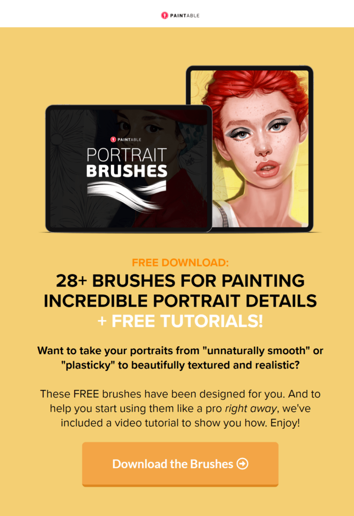
Then, it has testimonials in the form of Facebook comments.
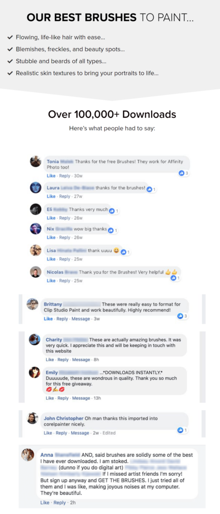
It has an example of how the product helped the customers. In this case, it is a digital painting done by one of the customers who took the course.

In the end, it has a section that explains frequently asked questions together with the CTA button.
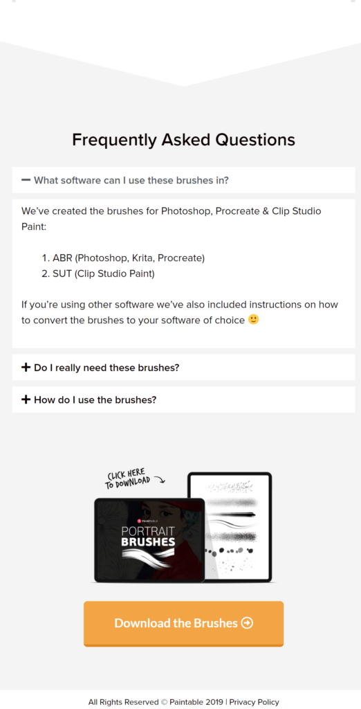
You can compare it with this example of a landing page used for a sales funnel:
On top, it has the name of the offer and an invitation to buy the product.
The offer is backed up by a testimonial from a previous customer and a description of the offer.

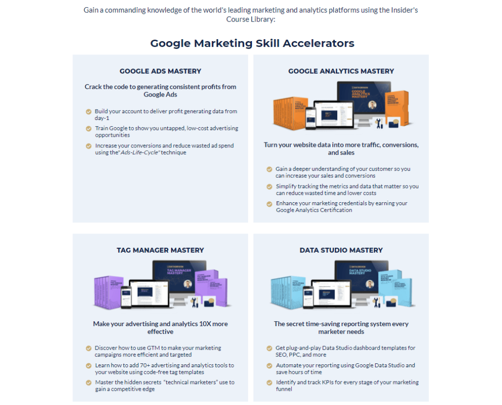
The next section shows the latest products offered by the company – in this case, it’s a list of courses customers can sign up for.
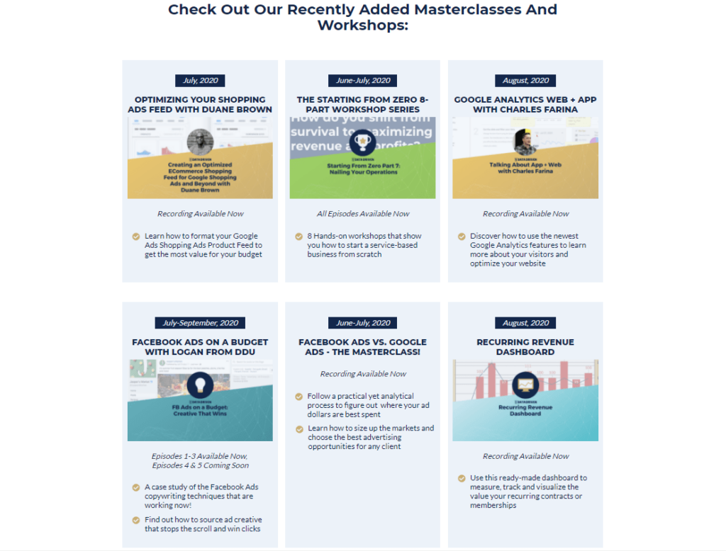
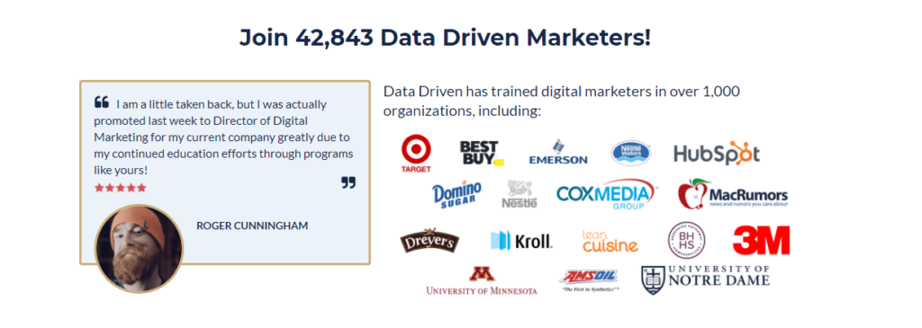
Then, the customers can see another testimonial from a previous customer and logos of organizations that bought the product.
The next section shows what’s inside the main offer and what clients will have access to once they decide to buy the product.
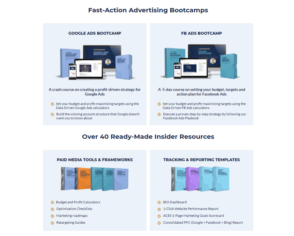
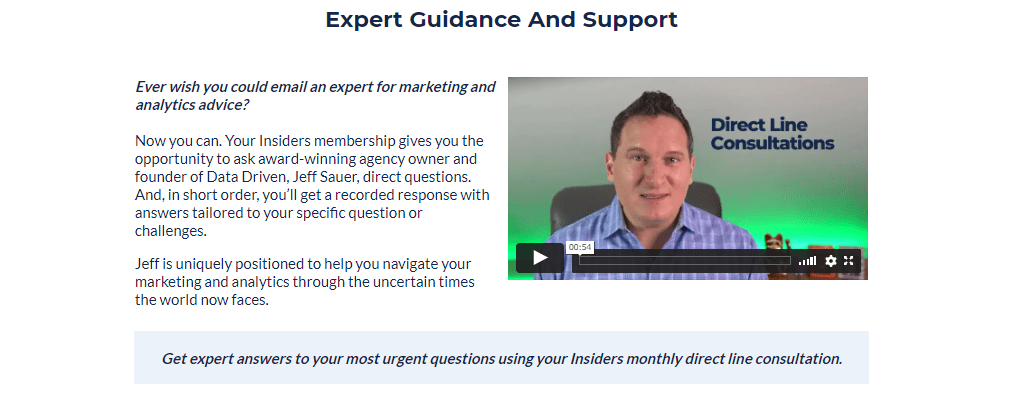
There is also a promise given by the company that everything is done by an expert and that the customers will always get support when they need it.
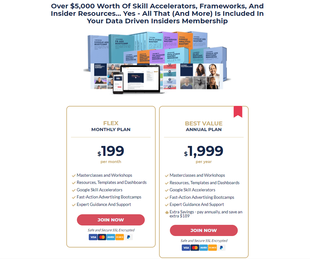
In the end, there is information about the price of the main offer. If you have different plans for your offer, you can show it to your clients like this:
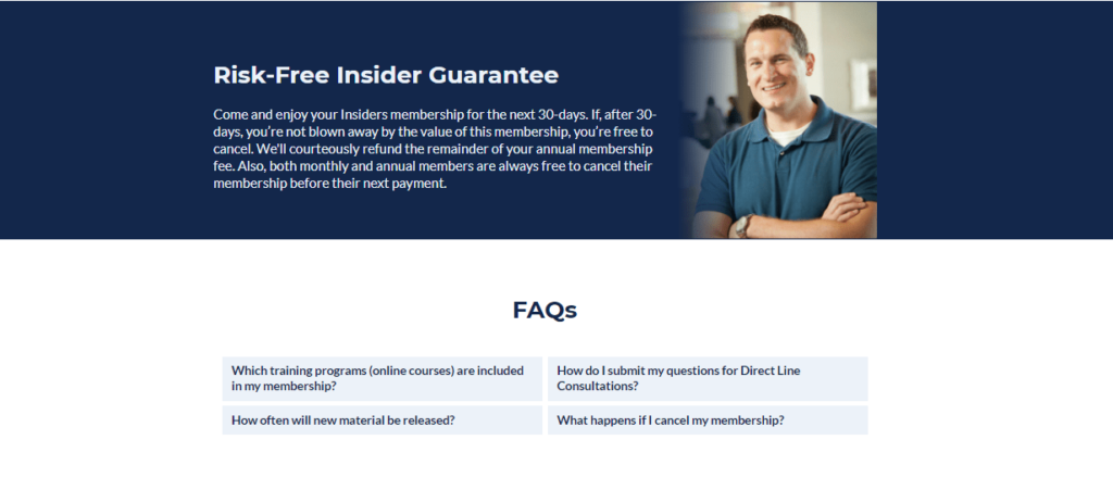
At the very end of the website, customers can see the guarantee given by the website and answers to Frequently Asked Questions.
Understanding your landing page conversion rates
Conversion rate is the main metric we use to measure how a landing page is performing. To calculate it, divide the number of people visiting the page by the number of people who click through to the next stage of your funnel.
The conversion rate of an average landing page that uses lead magnets is 40-60%. There are some landing pages converting better and hitting 60-80%.
If you’re trying to figure out what your conversion rate is, there is a simple way to do it. Just take the number of conversions your page generates and divide it by the number of the website’s visitors.
It might be a little discouraging at the beginning if your numbers are not exactly what you expected, but don’t worry. While it takes some time to figure out the best way to improve your pages so they convert well, most people are able to get higher numbers very quickly.
Want to boost your landing page conversion rate?
Now you understand more about how to improve your sales funnel landing page. It’s time to get to work implementing some changes.
If you don’t have your own landing page yet or you have one but you feel like it could convert better, book a call with us.
We will be happy to answer any questions you might have and help you figure out how to optimize your funnel and high-converting landing pages.


